Emma Pfützenreuter
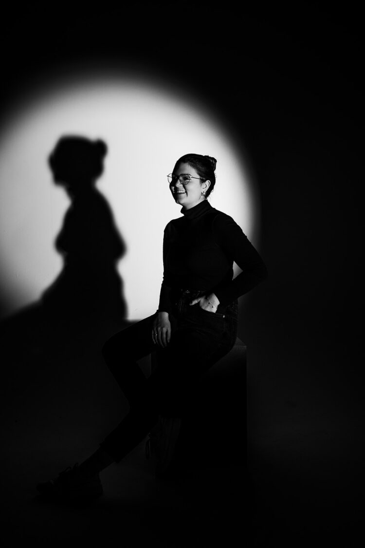
Bachelor of Arts Communication Design
My heart beats for typography, print and paper – I’m particularly enthusiastic about elaborate printing techniques and the haptic experience. I am always looking for the best possible result and the smartest design solutions – with a special eye for detail. Now I’m looking forward to expanding my knowledge and exchanging ideas with other creative minds.
Used Software
Indesign, Illustrator, Lightroom
Contact Details
- Mail: hi@emma-reuter.de
- Instagram: ep_reuter
URBAN LETTERS – Typography shapes spaces.

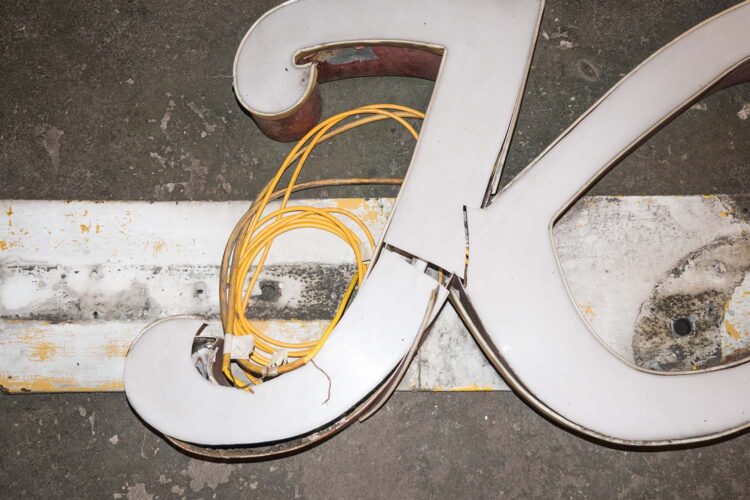
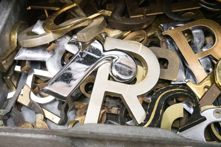
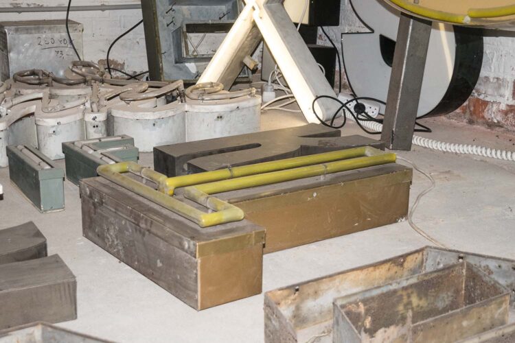
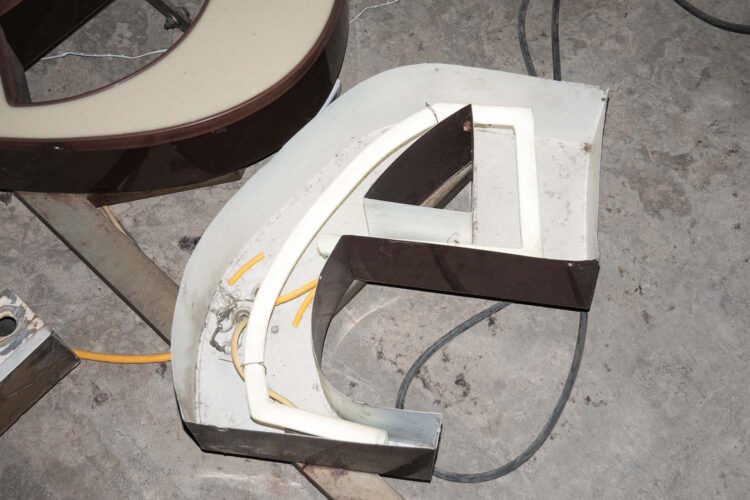
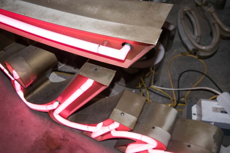
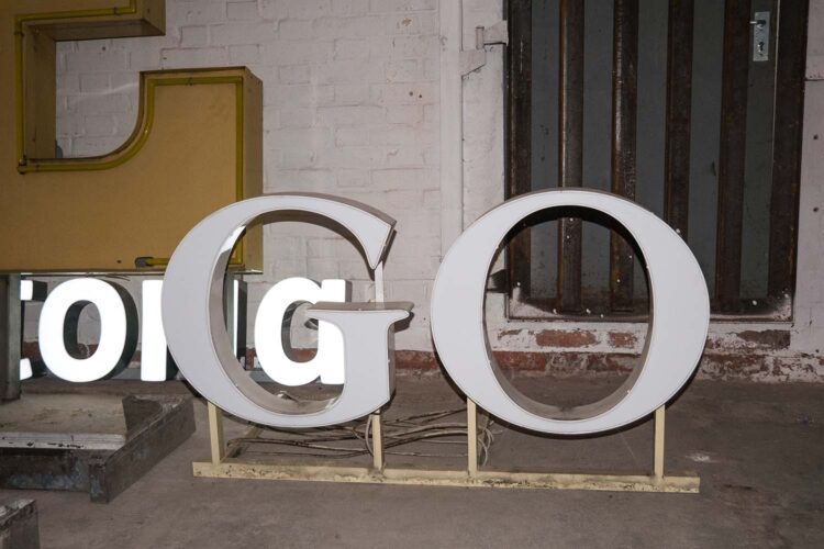
URBAN LETTERS sharpens the eye for everyday life. We encounter typography, usually without consciously noticing it, and yet it plays a decisive role in shaping the appearance of an urban landscape. This collection of photographs and stories invites us to discover and linger.
The writings and signs of our surroundings contribute to their identity just as much as the city´s map or the architecture – even if they are such a common part of our everyday life that we often pay little attention to them. If you move attentively through the city, you discover the variety and the sometimes unique representation of letters, which unfortunately disappear more and more. Change and renewal are part of the essence of urban space. Marked by past times and weathering, the three-dimensional letters preserve a part of the history that passes by them – whether on the facades or in other places in the cityscape. The bookazine aims to expand awareness of details, material and form. It documents stories and offers a different perspective on the presence of typography.
- First Examiner: Prof. Dipl.-Des. Rüdiger Quass von Deyen
- Second Examiner: Dipl.-Des. Elisabeth Schwarz